

On the podcast:


freshly launched
Showit & Website Tips


meet your designer
Joanna Moss


With two decades of experience designing websites, I'll take the swirling ideas in your head and turn them into a site that drives real results.
I help modern entrepreneurs elevate their online presence with Showit websites that convert. I love working with authentic business owners who are true to themselves and want a website that reflects that.
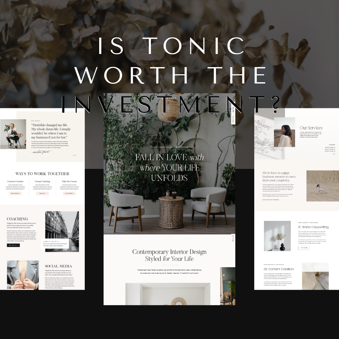
tonic template reviews & resources:


Get the stories + strategies I only share with my inner circle
From late-night Vespa drama to the behind-the-scenes of building websites that actually work — my newsletter is where I share the lessons, strategies, and inspiration I don’t post anywhere else.
Join the list today and I’ll send you this week’s email right away. You won’t want to miss it.
recently posted:


Showit Tips →
for designers →
website strategy →
SEO strategy →


Tonic Templates →
Behind the Scenes →
BROWSE BY CATEGORY
BRAND UNMUTED
Brand Unmuted is where I share practical tips and strategies on Showit tips, Tonic templates, copywriting, and website strategy, helping entrepreneurs and designers build brands that can’t be ignored.


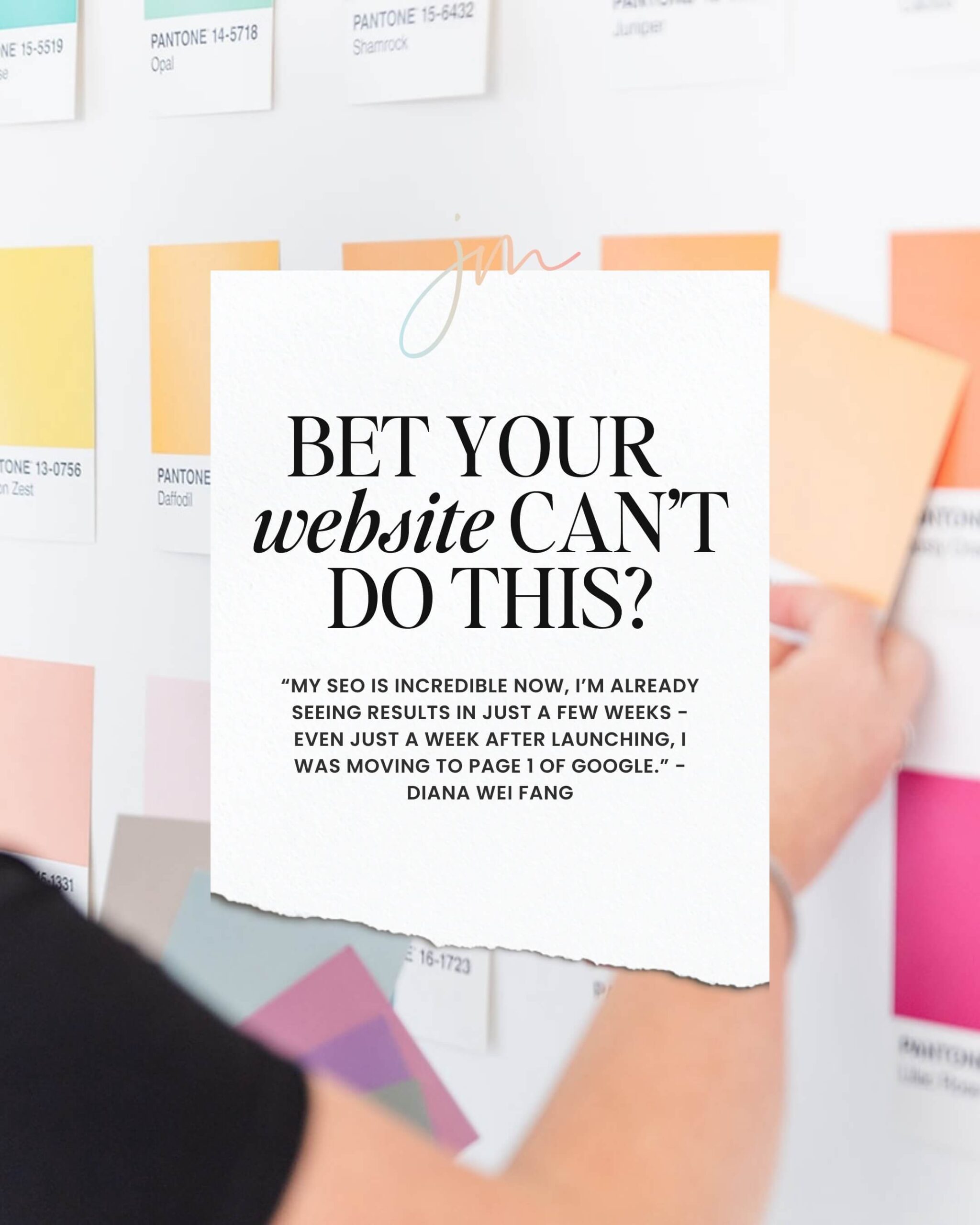
Client words
Diana saw an increase in organic traffic by 50% a month after launching.
view the portfolio