Based on the Quiz your website style is Deep & Bold.
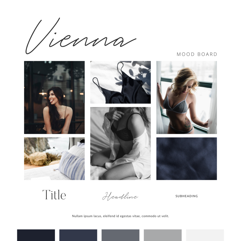
The Deep & Bold website style is perfect for photographers wanting to show a more edgy side to their brand. This works especially well for boudoir photographers and intimate wedding photographers. You may see darker overlays and more background photos & videos in this type of website style to add more depth.
This website style works well for photographers that have a dark & moody or slightly underexposed preference in their photo editing. It allows for more mystery in the photos and a more extensive portfolio.
Colour Palette suggestions
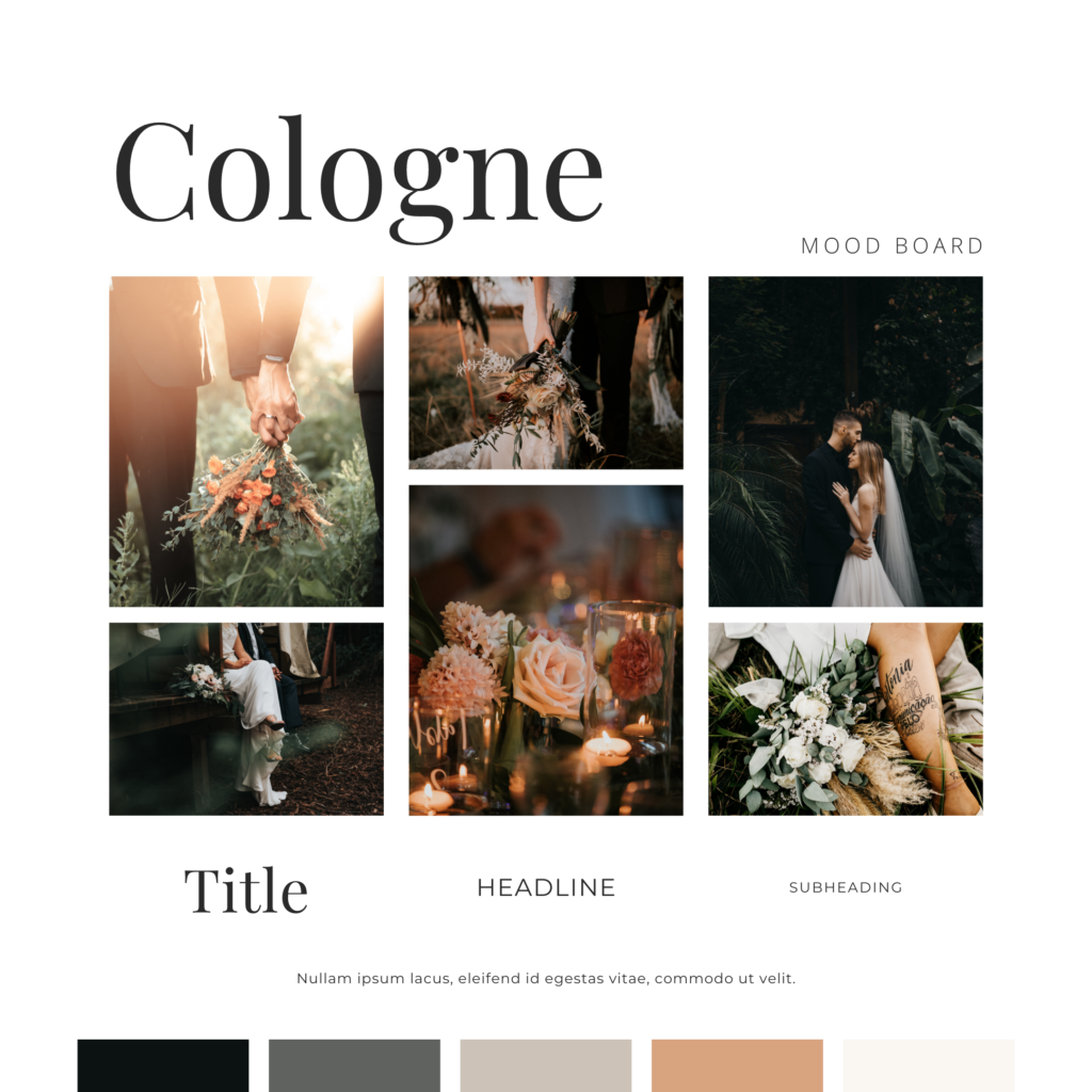
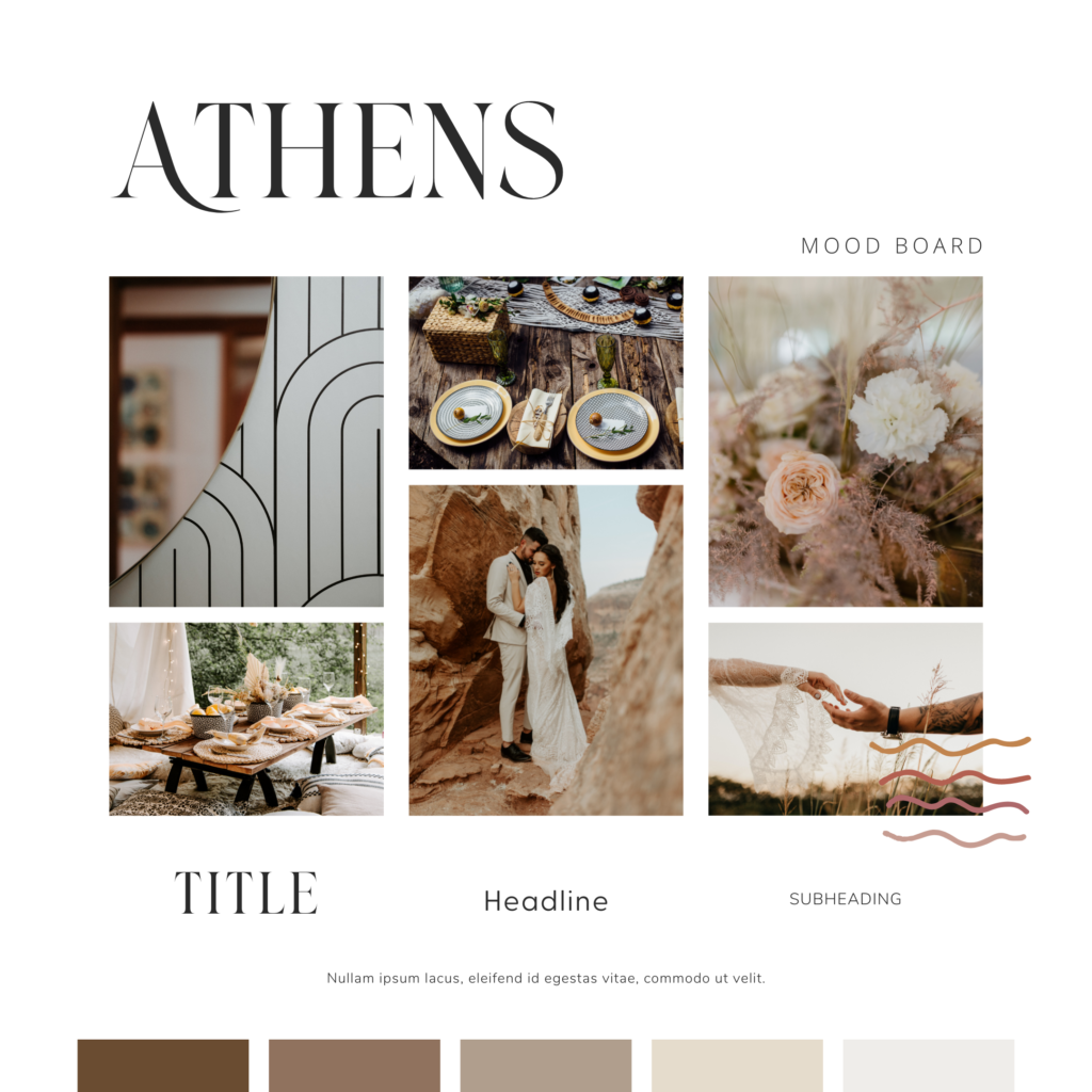
This deep & bold style doesn’t mean that you have to have a dark website, it just means that the design needs to lend well to photos that are going to be on the bolder and darker side. Here is a great example of deep & bold brand boards.
Showit Template recommendations
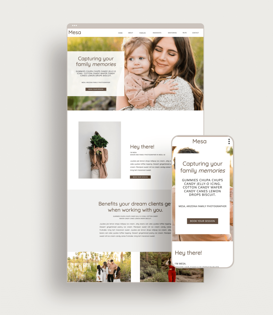
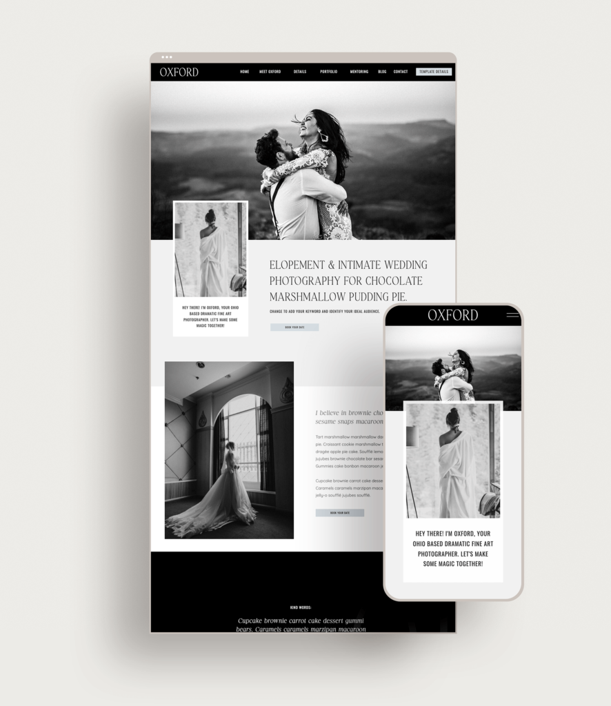
There are three templates that I would recommend for the Deep & Bold Website Style. The Montenegro, Mesa & Oxford templates use bold shapes & colour with a strategic advantage and offer different features.
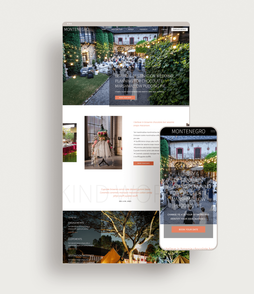
The Montenegro template is perfect for wedding industry vendors (photographers & planners) that want to show off more depth to their wedding style.
The Mesa template is great for family photographers that offer a couple of different services as well as mentoring or coaching, without overwhelming the visitor.
The Oxford template is a bold new template. It is black and white to offer a bold approach and allow your photos to bring the colour.
Showit Discount Code
Drop your info below and I’ll email you a link to get one month free off your yearly Showit Subscription.
Check out the other Website Styles:
Shop Tonic Website Templates
Tonic has my absolutely favorite templates in the game – their websites somehow combine killer strategy AND stunning, standout design. You're going to feel so confident in your new site!