Based on the Quiz your website style is Fun & Playful.
The Fun & Playful website style is perfect for photographers that want an approachable brand style. This works especially well for family and senior photographers wanting to attract modern and playful clients.
This website style works well for photographers that have a vibrant colour portfolio and want to show off how fun their photo sessions can be.
Colour Palette suggestions
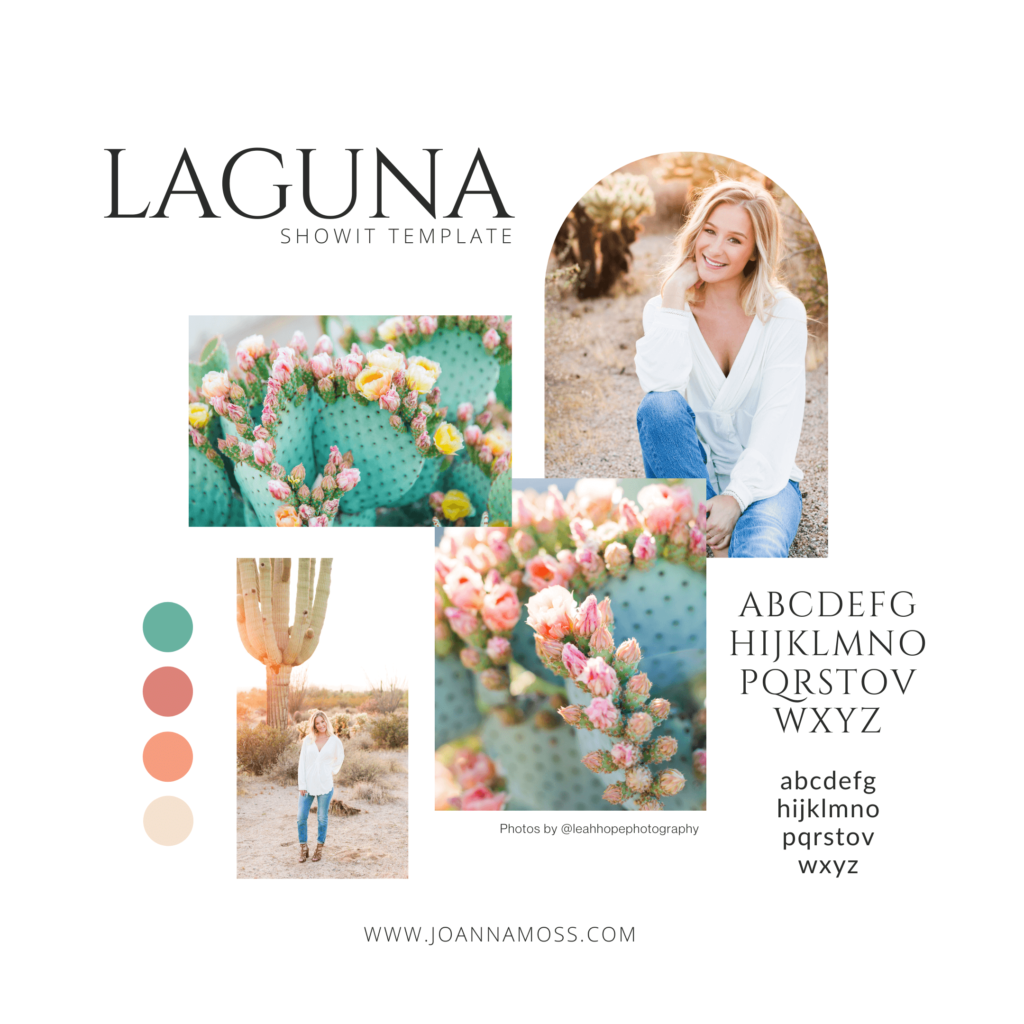
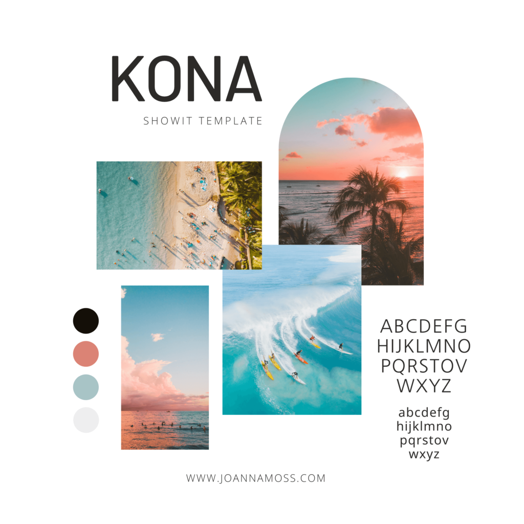
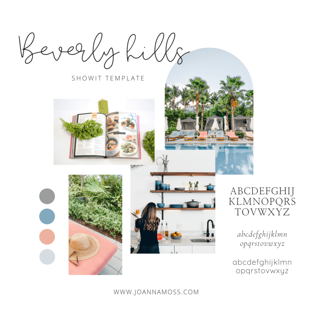
A fun & playful website style can still be modern and sophisticated. It doesn’t have to be childlike or tacky. Here is a great example of Fun & Playful brand boards.
Showit Template recommendations
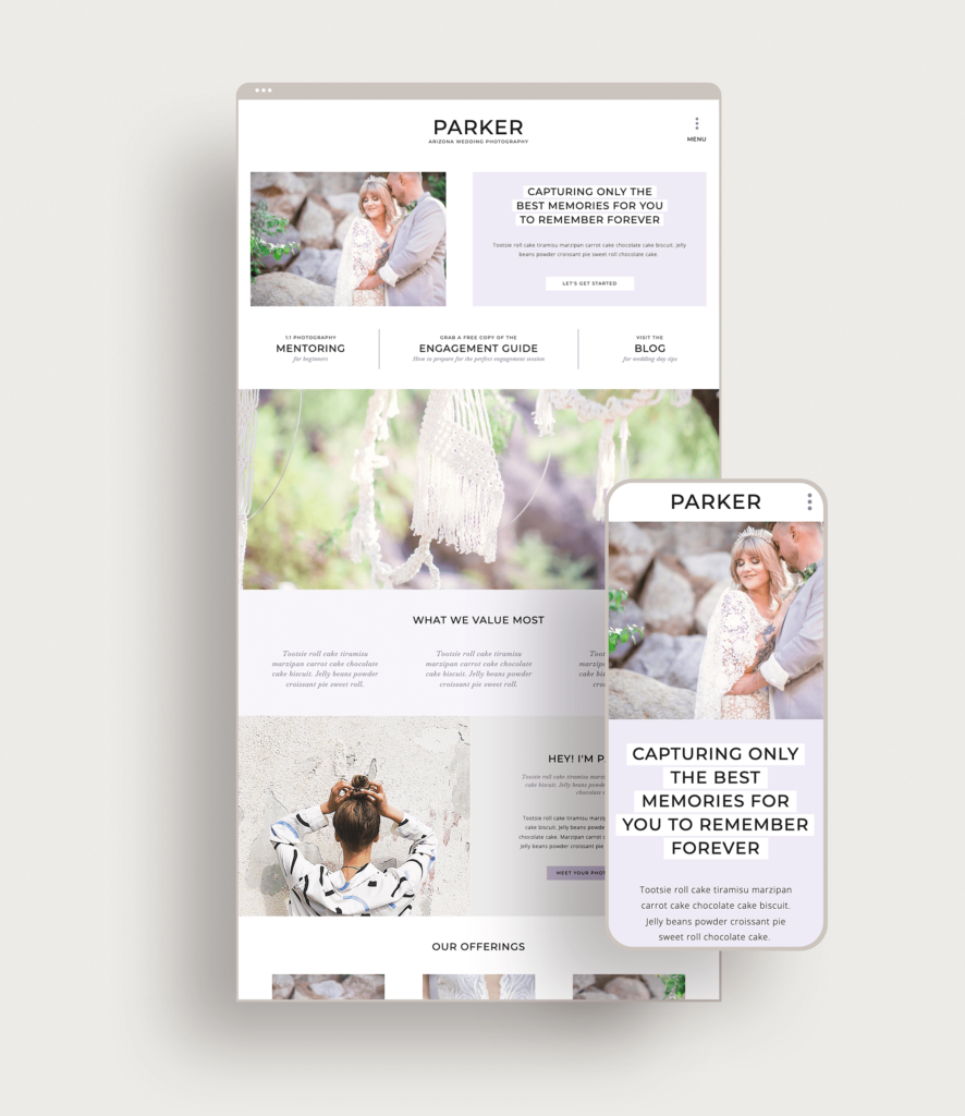
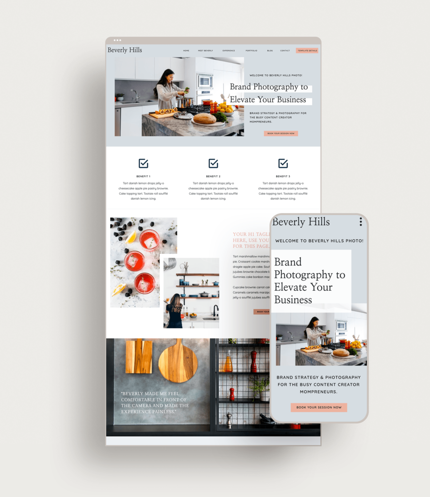
There are three templates that I would recommend for the Fun & Playful Website Style. The Laguna, Parker & Beverly templates all use colour to their strategic advantage and offer different features.
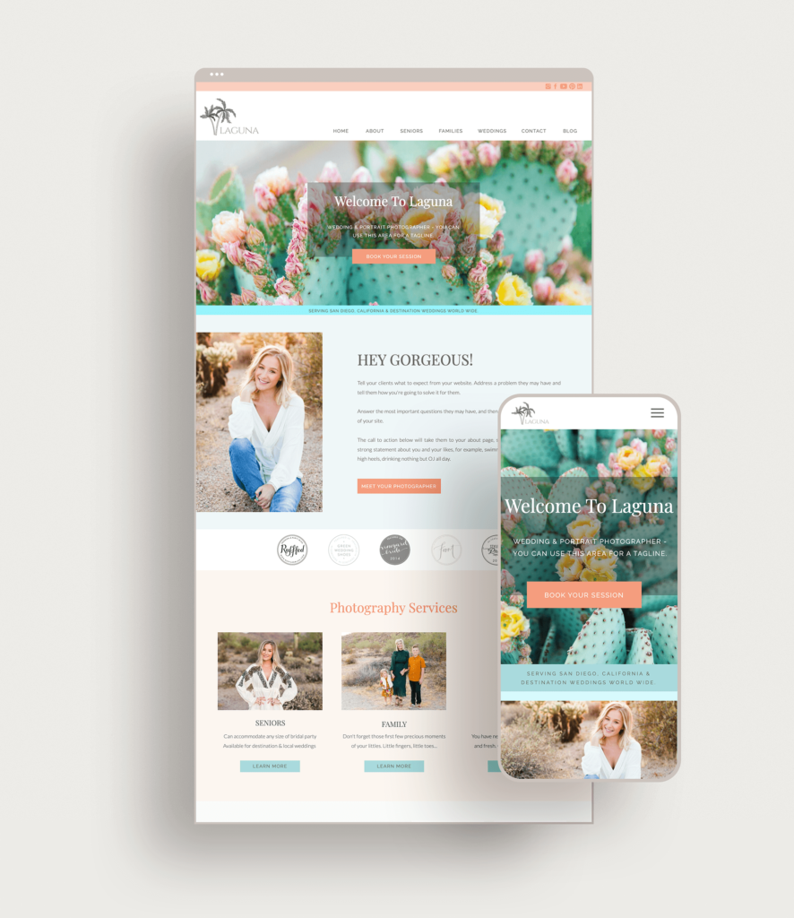
The Laguna template is great for photographers that offer a couple of different services. This template is more colourful than most and allows for lots of creativity.
The Parker template is perfect for photographers that offer one type of photography service. It is a modern template that offers lots of places to add bits of colour.
The Beverly template is a modern template with lots of pages for a more complete look. This template is perfect for brand photographers wanting to share a vibrant portfolio with their clients.
Showit Discount Code
Drop your info below and I’ll email you a link to get one month free off your yearly Showit Subscription.
Check out the other Website Styles:
Shop Tonic Website Templates
Tonic has my absolutely favorite templates in the game – their websites somehow combine killer strategy AND stunning, standout design. You're going to feel so confident in your new site!