Your website is not a scavenger hunt, don’t make your visitors search for what they need. This blog post is all about building a clear website that will guide your visitors to sales.
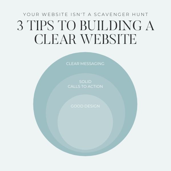
Solid calls to action help build a clear website
When you’re building your new Showit website you want to make sure that you have clear calls to action. Your calls to action should guide your visitor through your website in the way you intended it. For wedding photographers for example; you should guide your potential couples from the home page to your portfolio to your services and to contact you to book a consultation. However along the way you should have calls to action to your contact if they are ready to book you mid-way through your tour. Never make your potential client search for how to contact you. That should always be front and centre.
* For more information about Calls to Action please checkout this blog post.
CONVERSION TIP: Hi to Buy in 3 clicks or less. You have less than 3 clicks to take your visitor from the home page to the checkout/contact page, or there is a greater chance they will lose interest and leave your website.
Deliver a clear message to build a clear website
Cute and clever content will confuse your client. Delivering a clear message to your client is always better than clever & cute language. If you are a wedding photographer, tell your potential bride & groom that’s what you are. Don’t make them guess by calling yourself a love storyteller. Yes, it’s beautiful, but if the couple has not been exposed to your work before, it can be confusing.
There are 4 areas where you should always use clear messaging:
– Who you are.
– What services you provide (& the pricing*).
– What area you service.
– How to contact you.
* I am not saying that you have to put pricing on your website. I do think that it should be clear to your visitor that they have found the area where pricing should be. You can have a starting at price, an average price, or no price and make a note to say contact me for pricing. However, you don’t want to leave it out completely and have your visitor guessing if they just missed the pricing somewhere. For more about Should you add pricing to your photography website check out this post or this post about 4 ways to add pricing to your website (or not).
Good design creates a clear website
A well-designed website will always benefit your business. It will make your business look more professional, legitimate, and give confidence to your potential client about buying from you. A good design will guide your potential client through your customer journey. A website that is easy to navigate will also show your potential client that you are easy to work with, that it will be easy to communicate with you, and that will go a long way to client confidence.
These are just 3 Tips to building a clear website that will convert more visitors into raving customers. Download the Website & SEO Checklist for a more complete list of things to check on your Showit website to update it for 2021.
For more great tips like this check out my Instagram profile.

Shop Tonic Website Templates
Tonic has my absolutely favorite templates in the game – their websites somehow combine killer strategy AND stunning, standout design. You're going to feel so confident in your new site!