Your potential clients are relying on your experience to guide them through your website. Clear and frequent calls to action will help you guide your client through your website the way you want them to shop. Whether you’re selling a product online or you’re selling a service. You want to make is super easy for your client to get from your home page to a sale.
Your action buttons should guide your clients through your website from the home page, to the different areas of your website. This should be done in a 3 step process (more then 3 steps and you’re going to lose the sale). It should also be done in a logical progression.
Good Calls to Action till guide your client through your website in a logical order.
For example, a photographer will want to guide their client from their home page to their gallery, to their pricing and then to the contact page. Along the way you can add a “Book your session” button, or a contact form, on every page of your site. This way when your user is ready to purchase then don’t need to take another step to contact you.
What to do:
- It’s clear where the link is going to take the user
- There is a clear purpose to your actionbuttons. I’m on the gallery page and want to know how much a services like this is going to cost, so a logical call to action is to take users to your pricing page.
- If you’re selling a product online, make sure it’s easy for users to quickly buy the item without too many steps. A Quick Buy button is a great add to a product page.
- If you’re selling a service and want users to contact you to book. Consider adding a contact page or at least a contact me call to action to the bottom of every page.
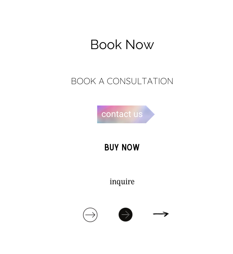
Here are a few button examples:

What you want to avoid:
- Don’t use calls to action to take your users around in a circle around your website with no clear purpose.
- Don’t just put one call to action on a page and hope that it’s enough. Most people think their website has too much “sales-y” information when it actually doesn’t have enough. Make sure you make it easy for people to buy your services.
- Avoid calls to action that blend in too much with your content. Make sure it stands out (like the above examples).
Shop Tonic Website Templates
Tonic has my absolutely favorite templates in the game – their websites somehow combine killer strategy AND stunning, standout design. You're going to feel so confident in your new site!