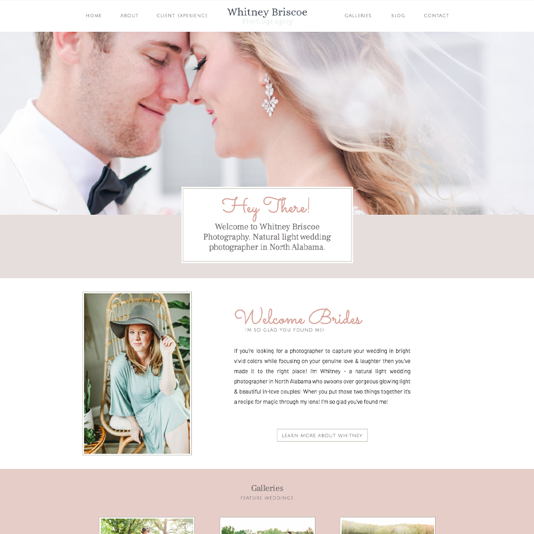
I’m so excited to share with you this new website design for Whitney Briscoe Photography.
Whitney came to me with no previous website, however, she’d been in business for many years before, she wanted a new website design. She wanted a professional-looking website where she can send her potential clients. She gets a lot of her bookings from referrals, so she wanted a place with her curated portfolio for others to refer potential clients.

The Brand
We created a custom website to her brand. Whitney’s brand is very elegant and feminine, so we wanted her website to reflect this style. We wanted to keep a lot of white space on the site so that her photographs were the highlight of the site.
The New Website Design
The functionality of this website is fairly simple. We wanted a place for Whitney’s potential brides to see her work and where she’s located. Also to learn a little more about her. The site refers brides to the newest work on her social media. And invites them to contact her in multiple touchpoints around the site.
Content Tip: One of the biggest pain points for a client that is having a new website design for the first time is that they don’t have enough content to fill the space. I always recommend at the very least 350 words per page, however the more quality content you have the better it is for your SEO. For clients that don’t have time to create their content I highly recommend hiring a copywriter to do it for you. I also have this document that will help you get started on content creation.
If you’re still sending clients to your Instagram account to see your portfolio, it’s time for a new website. We’re here to help you with customizing templates to custom website design. For more information about website design please contact us.

Shop Tonic Website Templates
Tonic has my absolutely favorite templates in the game – their websites somehow combine killer strategy AND stunning, standout design. You're going to feel so confident in your new site!