As you can tell by my most recent posts I added an inline with image Flodesk form to the bottom of my posts. I used the Flodesk template because it is modern and simple. I will allow my readers to get a freebie right in the blog post with no extra clicks.
What I did.
I started in Flodesk by creating a new audience segment for my blog. Then I created the inline form with an image. It was simple to create and even added a mobile-friendly version. Once that was all done I tested it out by adding the code into my blog post.
How do you add the code?
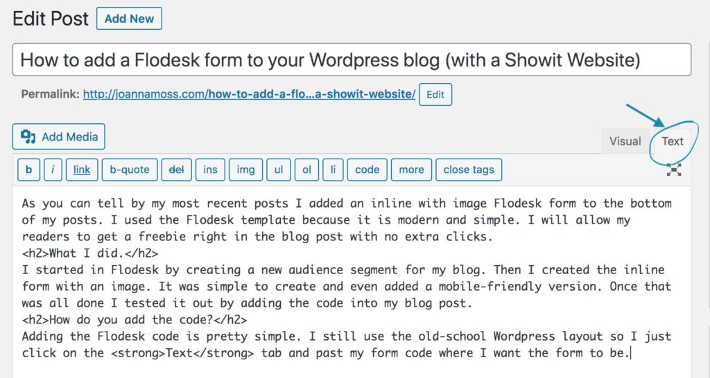
Adding the Flodesk code is pretty simple. I still use the old-school WordPress layout so I just click on the Text tab and past my form code where I want the form to be.

This is where things stopped working
So I thought I was all done. I finished my posted and published it thinking hurray all done, that was easy. Not so quick. When I went to view my new post I noticed that the mobile version of the form was showing up not the desktop version. This may not bother you, and if it doesn’t you can stop reading here. But I was promised an inline form with an image (the mobile version doesn’t have a photo), so that’s what I wanted. I searched online to find out why this was happening, no luck, I asked in the Facebook group, also no luck. I went searching through the Flodesk help files and that’s when I found it.

You can read the entire help document here >
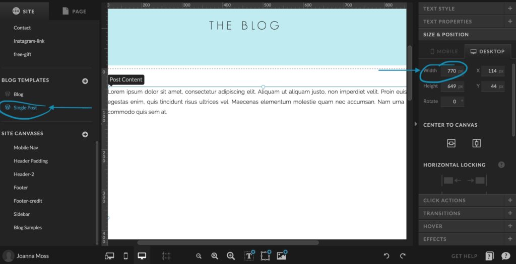
The website container needs to be 768px or the browser will think you’re reading the blog post on a mobile device. Aha! That’s the answer.
How did I fix it?
I logged into my Showit account to check my blog post page and sure enough, my content area was only 650px wide. Not long enough to use the desktop version of the Flodesk form. I looked at the overall design a knew I could make my content area bigger without affecting the rest of the template design. So I increased the width and published the site.

It worked!
When I refreshed my blog, presto it worked. (As you can see from the bottom of this post). I had my Flodesk form just the way I designed it in Flodesk.
Sign up for Flodesk and get 50% off your first year!
If you want more of this type of website design & SEO tips you can join the community in two ways!
- You can get tips right in your inbox (every other week unless there is a promo being launched) by filling in the form below. You’ll also get the Website Review Checklist as a Thank you gift.
- You can join the Website Education Community Facebook group.
Shop Tonic Website Templates
Tonic has my absolutely favorite templates in the game – their websites somehow combine killer strategy AND stunning, standout design. You're going to feel so confident in your new site!