I’m going to give you a little backstory to this post. I’m going to take you back to the early 2010s. I was a wedding photographer and I was a new mom with two boys under the age of 4. Needless to say, my days were extremely chaotic. Some things that I thought weren’t as urgent took a back seat to other tasks and projects. I had created a decent-looking website for my photography business using WordPress (& ProPhoto) but I didn’t have time to blog on a regular basis or update my website as I booked more clients. I knew I should but I just didn’t have the bandwidth to take it on. At that point I was thinking, well the website is there, it’s not the best, but it’s not hurting me… right? WRONG! My just “OK” website was costing me clients.
How my OK website was costing me clients
I was not offering a clear message
As my business evolved I would add things to my website here and there. I would add a new photography service I wanted to offer, or add a new portfolio to show my latest work. There was no purpose to what I was sharing and it was becoming a bag of mixed messages. My clients couldn’t tell if I was a family photographer or a wedding photographer (or both?).
I wasn’t showing consistency in my work
As I learned new techniques my editing style slowly changed as well. When I was adding new work to my portfolio I was not showing consistency in my photography or editing. I was showing a mixed bag of early work and new work, and confusing my potential clients as to what photographer was going to show up to their session.
I wasn’t able to raise my prices
Since my website was not getting the leads that I needed it to, to be able to consistently book, I was scared to raise my prices. I was getting mixed messages from my clients and potential clients. Those clients that took a chance and booked me, loves my work and loved working with me. However, my booking was not consistent and I could see there was a huge gap in the amount of traffic coming to my website and the number of leads that I was actually getting.
I was only 3 years into my photography business, but I knew if I wanted to book more consistently and be successful at this thing I loved to do, I needed to make a change.
It was time to redesign my website.
How redesigning my website helped me book more clients
Clarify my message
When I redesigned my website it gave me an opportunity to think about what message I wanted to deliver to my clients. I was able to clarify my message and focus more of the transformation I was offering vs just the services they can purchase from me.
Switching platforms from WordPress to Showit
So that I was confident that my new website was the best that it could be, I explored the different platforms that were being used for website design at the time. After researching the different platforms and what they offered I decided to make the switch from WordPress to Showit. Showit is a drag & drop platform that offers a lot more flexibility in design than WordPress. It also doesn’t require any coding to make changes and updates, this made it a no-brainer for me because at the time my biggest issue was finding time to keep my website up to date. There were also lots of beautiful templates that I could work with to start my re-design process, so it didn’t take me a long time to learn the new platform. (Yes there was a learning curve, but because there was no coding it was fun!).
Showing more consistency
Since I was redesigning my website, it gave me an opportunity to review my portfolio and pull out only the work that represented where I was at the time as a photographer. I only showed my most recent style of photography & editing so my clients knew exactly who was showing up for their shoot.
I was able to raise my prices
The new website gave me the confidence to raise my prices. I could see a transformation in how my business was going to be perceived by my potential clients. I worked on my new client avatar, created an ideal client and was able to create new offerings at higher prices that I knew were going to be well received by this new client.
Showit Discount Code
Drop your info below and I’ll email you a link to get one month free off your yearly Showit Subscription.
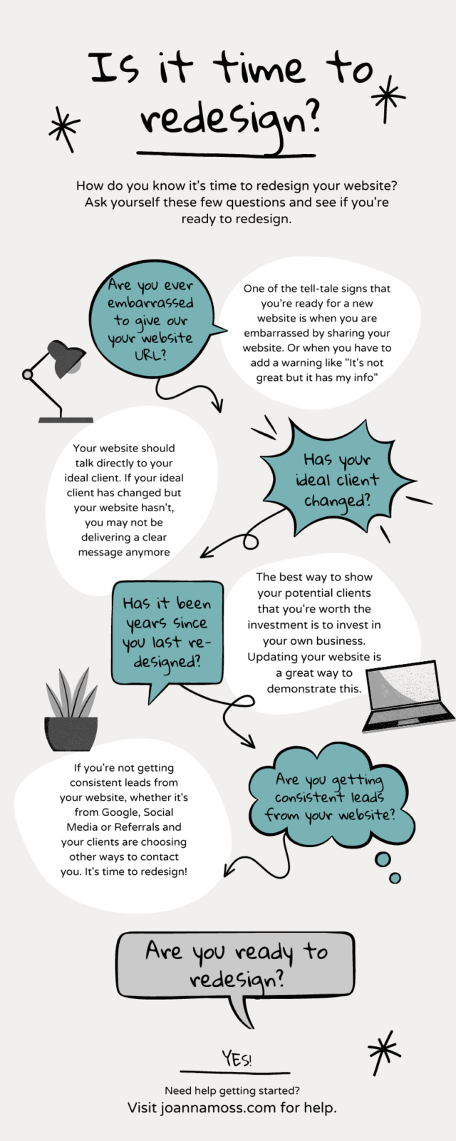
Is it time to Redesign Your Website?
Now that you’ve learned from my lesson of how having an OK website was costing me clients. It’s time for you to review your current website and decide if it’s time to redesign. You can use the graphic below to see if it’s time to look into redesigning your website. If you need help with the next steps I can help!

Shop Tonic Website Templates
Tonic has my absolutely favorite templates in the game – their websites somehow combine killer strategy AND stunning, standout design. You're going to feel so confident in your new site!
