The Benefits of Using Showit for Responsive Website Design
May 18, 2023
post Last Updated:
What is Responsive Website Design? Responsive website design is a type of web design that allows webpages to adapt to the screen size of the device that they are being viewed on. This means that whether someone is viewing your website on a desktop computer, a tablet, or a smartphone, they will be able to […]
post Last Updated:


What is Responsive Website Design?
Responsive website design is a type of web design that allows webpages to adapt to the screen size of the device that they are being viewed on. This means that whether someone is viewing your website on a desktop computer, a tablet, or a smartphone, they will be able to see the content in a way that is easy to read and navigate.
This can save you time and money, as you won’t need to create separate sites for each device. Showit also makes it easy to change the look of your site for different devices, so you can make sure that your visitors have the best experience possible no matter how they are accessing your site.
What is Showit and How Can it Help with Responsive Website Design?
Showit is a web design platform that allows users to create responsive websites without having to code. It uses a drag-and-drop interface, which makes it easy for users to create and edit their website content. Showit also offers a wide range of templates and designs that can be used to create a professional-looking website.
Benefits of Using Showit for Responsive Website Design
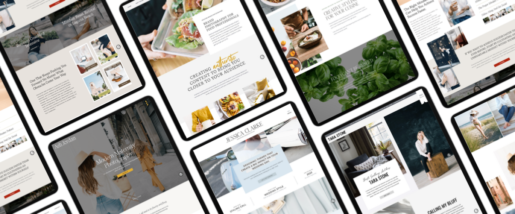
There are many benefits of using Showit for responsive website design. First, Showit is a platform that allows you to create websites that are responsive to different screen sizes. This means that your website will look great on all devices, from desktop computers to mobile phones. Second, Showit is easy to use and you can create a professional-looking website without any coding knowledge. Third, Showit offers a wide range of templates and features, so you can create a unique website that fits your brand. fourth, Showit’s customer support is excellent and they offer a 14-day money-back guarantee. Showit is an affordable option for responsive website design.
Tips for Optimizing Your Showit Site for Mobile Viewers
- Keep your design simple and uncluttered.
- Use large, easy-to-read fonts.
- Stick to a limited color palette.
- Use plenty of negative space.
- Optimize your images for mobile devices.
- Use responsive web design principles.
Showit is an effective and efficient tool for designing responsive websites with its user-friendly interface and advanced features. With Showit, you can create a website that looks great on any device or browser while still being easy to update and maintain. And with the ability to integrate custom code, the possibilities are endless! We hope this article has shown you just how beneficial it can be to use Showit for your next website project.


Shop Tonic Website Templates
Tonic has my absolutely favorite templates in the game – their websites somehow combine killer strategy AND stunning, standout design. You're going to feel so confident in your new site!


Showit Tips →
for designers →
website strategy →
SEO strategy →


Tonic Templates →
Behind the Scenes →
BROWSE BY CATEGORY
BRAND UNMUTED
Brand Unmuted is where I share practical tips and strategies on Showit tips, Tonic templates, copywriting, and website strategy, helping entrepreneurs and designers build brands that can’t be ignored.


