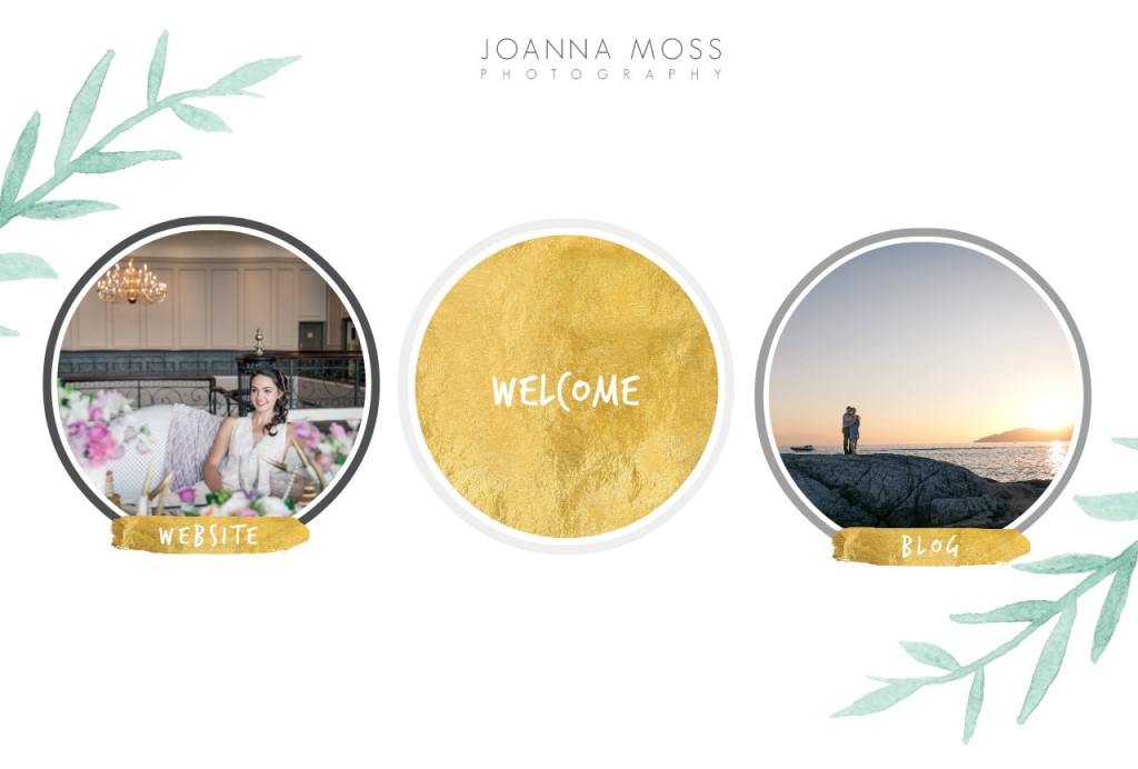
I’m very excited to share with you the new Joanna Moss Photography.
The new website and branding has been months of intense planning, designing and redesigning. In a past life I was a graphic designer; I found it fun and free to design websites and marketing materials for companies that needed a branding facelift. I gave my clients few options so it was easy for them to make a decision on what direction they wanted to take their company. However I found that when I’m working on my own website now, for my company I have waaaay too many ideas in my head, I change my mind mid-thought, I couldn’t decide on what style, design and colours I want.
During the re-design process I was introduced to a program called ShowIt; it’s a very cool application that allows me to take a website template and edit it and make it my own with very simple drag and drop options. This gave me a starting point because after seeing some other photographers websites, I knew that I wanted my website to be a ShowIt website – this was an exciting step for me, finally a decision.
So after months of putting together, editing and curating images I’m so very proud to introduce you to my new website. The brand style is very modern, clean and fresh. The colour scheme is very simple greys, white and a hint of green. I also incorporated the circle, the circle is a symbol often talked about at weddings because it’s a sign of unity, infinity and strength, like the wedding ring. As a wedding photographer I am invested in love, in the unity of two amazing people that was to share infinity together. The ring symbolizes their bond and strength.
I hope you enjoy the new website! I’d love to hear your thoughts!

*EDITED: Just wanted to add that the new BLOG is up as well. I am more excited about this than anything because I love love the new style. It makes it easier to see the posts, it makes me want to be more consistent with my writing so that I can fill all the tiny boxes with content and photos. 🙂
Shop Tonic Website Templates
Tonic has my absolutely favorite templates in the game – their websites somehow combine killer strategy AND stunning, standout design. You're going to feel so confident in your new site!