So I’ll be honest—I used to hate popups. They always seemed intrusive and annoying, flashing up at the worst possible moments and driving me away from websites rather than pulling me in. I thought, Who would ever want to use these things on their own site?
But then I discovered BDOW.
BDOW completely changed the way I think about popups and forms. It’s not just about throwing a random popup at your visitors and hoping for the best. BDOW takes a thoughtful, strategic approach to when and where forms should appear, making it all feel more organic, less intrusive, and (most importantly) more effective at turning casual visitors into leads.
Now, when I use BDOW on my Showit websites, I’m not only confident that the popups will look beautiful, but I also know that the strategy behind their placement is sound. The smart marketing features make the whole process seamless—and I actually find myself enjoying tweaking my forms to get even better results.
So, if you’re like me and have been wary of using popups and forms, let me share how BDOW can change your mind. Here are six ways you can leverage BDOW on your Showit website to drive more leads and convert more visitors.

Use BDOW Forms for Attention-Grabbing Popups
Like I said, I used to avoid popups at all costs. But what I realized after using BDOW is that it’s not just about throwing a form in front of someone’s face—it’s about design and timing.
BDOW popups are visually appealing and customizable, so they fit seamlessly into your Showit site without looking out of place. You can adjust the colors, fonts, animations, and more to match your brand perfectly. But the real game-changer? BDOW’s smart behavior triggers.
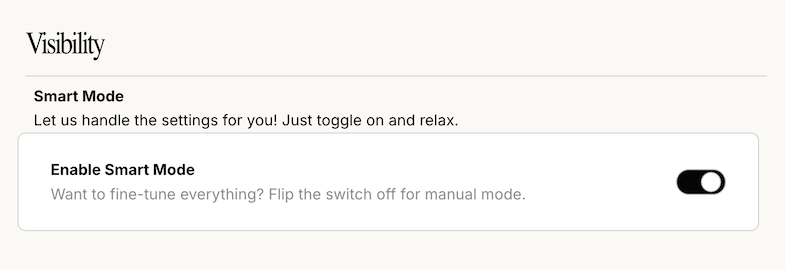
With BDOW, your popups appear at just the right moment—whether that’s when someone is about to leave your site, after they’ve scrolled through a certain percentage of the page, or at a time delay you set. The popup won’t feel intrusive because it’s triggered based on the visitor’s actions. You won’t have to worry about scaring away potential clients with mistimed popups anymore.
And, while BDOW takes care of the placement, you can focus on making your forms visually attention-grabbing with bold headlines, clear CTAs, and eye-catching designs that invite visitors to take action.
Pro tip: Place popups on key pages like your services page, blog posts, or portfolio. A well-placed popup can be the difference between a visitor leaving and them signing up for your email list or requesting a consultation.
Customize Forms for Different Sections of Your Showit Website
The first time I set up forms with BDOW, I quickly realized something: not all forms should look or act the same. Every section of your website has a different purpose, and BDOW lets you customize forms based on those sections.
Here’s how I like to break it down:
- Homepage: Keep it simple and straightforward. Offer a compelling opt-in for your newsletter or a freebie. Something quick and easy to fill out.
- About page: This is where visitors are learning about you, so I like to include a slightly longer form here that allows for more details—like a project inquiry form.
- Portfolio or services pages: Add a short, engaging form inviting visitors to request more information or book a discovery call.
- Blog posts: Offer content upgrades or freebies related to the blog post topic. These could be opt-ins for a free guide, checklist, or webinar.
BDOW makes it easy to create and customize these forms so that they feel relevant and not random. Visitors are more likely to fill out a form that feels natural to their journey on your site.
Enable Email Notifications for Form Submissions
I can’t tell you how many leads I missed out on in the past because I wasn’t quick enough to respond. People expect fast responses, and BDOW’s email notification feature changed everything for me.
Now, every time someone submits a form on my website, I get an instant email notification. This real-time alert means I can respond right away, making sure I’m at the top of their inbox when they’re most engaged.
Let me tell you—it’s a game-changer. Whether someone is inquiring about services or signing up for a freebie, being able to follow up quickly shows them that I’m professional and responsive. Plus, it helps me stay organized, so no leads slip through the cracks.
Integrate BDOW with MailerLite to Nurture Your Leads
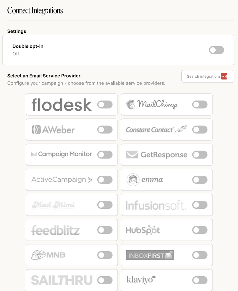
Once I started capturing more leads, I realized I needed a solid strategy for nurturing those leads. That’s where MailerLite comes in. BDOW integrates seamlessly with MailerLite, which makes it easy to build automated email sequences that keep those leads engaged.
Here’s how I use BDOW and MailerLite together:
- Automated emails: As soon as someone fills out a form, they’re added to my MailerLite email list, and an automated welcome series kicks off. I like to send a welcome email, followed by a series of emails that provide value and introduce them to my services.
- Segmentation: BDOW allows me to segment leads based on which form they completed. That way, I can send more personalized emails depending on whether they signed up for a freebie or requested more info on services.
- Nurturing leads: By staying in touch through regular emails, I can build relationships with my leads over time, so when they’re ready to work with me, I’m top of mind.
I’ve found this integration incredibly valuable. And if you want to give MailerLite a try, I’ve got an offer for you!
Optimize Mobile Forms with BDOW
We all know that mobile traffic is huge, so it’s important that your forms work just as well on mobile as they do on desktop. Luckily, BDOW takes care of that too. All of BDOW’s forms are fully responsive, meaning they adjust perfectly to any screen size.
Here’s what makes BDOW forms so great for mobile:
- Responsive design: No need to worry about your forms looking squished or awkward on smaller screens. BDOW automatically resizes them for the best user experience.
- Mobile-specific popups: You can create popups tailored for mobile visitors, making sure they’re optimized for smaller devices.
- Single-click submissions: BDOW makes it easy for mobile users to submit forms without too many steps, minimizing drop-offs.
Since I started paying more attention to mobile optimization, I’ve seen a noticeable increase in form submissions from mobile users. Don’t let poor mobile form design cost you leads—BDOW has you covered.
Test and Refine for Best Results
One thing I’ve learned is that testing is key to successful lead generation. Just because a form is working doesn’t mean it can’t work better! With BDOW, I love that I can test and refine my forms to continuously improve their performance.
Here’s how I approach testing with BDOW:
- A/B testing: I like to try out different form designs, headlines, and CTAs to see which ones convert better. Sometimes even a small change—like tweaking the headline—can make a big difference.
- Popup behavior: BDOW lets me adjust when and where popups appear, so I can test different trigger points to see what works best for my audience.
- Analyze the data: BDOW provides analytics on form performance, so I can track what’s working and what’s not. This helps me make data-driven decisions on how to improve my forms and get even better results.
Testing might seem tedious, but it’s one of the most valuable things you can do to maximize conversions. The insights you gain can help you fine-tune your strategy and create forms that are truly optimized for your audience.
Wrapping It Up
If you’re ready to take your Showit website to the next level, BDOW is the tool to help you get there. Whether you’re capturing leads with attention-grabbing popups, customizing forms for different sections of your site, or optimizing for mobile, BDOW makes the entire process seamless and effective.
And don’t forget to take advantage of BDOW’s real-time email notifications and MailerLite integration for nurturing your leads. These strategies have been game-changers for my business, and I’m confident they’ll help you too.
Ready to get started?
Use my link to get 20% off your first payment with BDOW (and it’s even more valuable if you go for the annual plan!).
Click here to grab the deal and start transforming your website into a lead-generating machine!
Happy converting!

Shop Tonic Website Templates
Tonic has my absolutely favorite templates in the game – their websites somehow combine killer strategy AND stunning, standout design. You're going to feel so confident in your new site!


